
Mobile-First or Bust: Why Responsive Web Design is Crucial in 2024?
- MarsDevs

- Apr 16, 2024
- 5 min read

As more people use their smartphones and tablets to access the internet, responsive site design is becoming increasingly vital. Almost three-quarters of web designers polled say that non-responsive web design is the primary reason people quit a website.
In 2024, it is critical to have a website that appears and works equally effectively on a tiny and large screen. But what is responsive web design?
As developers explain, "Responsive web design is a method of developing websites that guarantees they adjust to the size of the device being viewed! "It means that whether a consumer visits your website on a desktop computer, tablet/smartphone, they will get a consistent, optimized experience.
In this MarsDevs article, we will discuss why responsive web design matters in 2024 and why you should implement it. So, let's get started!
Static vs. Responsive Websites - What’s the Difference?
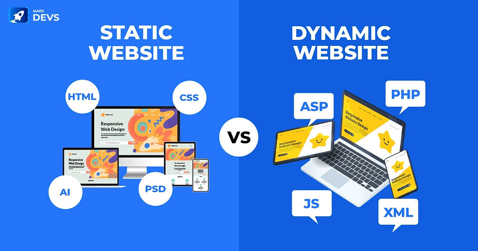
A static website appears the same on all platforms, which means the desktop version does not adapt to a mobile device. While static websites often have excellent SEO and loading times, they have limited functionality. On the other hand, a responsive website guarantees that the site appears beautiful on all devices & will change whether visited on a desktop, smartphone/tablet.
Ethan Marcotte, a web designer, first developed the notion of the fluid grid over a decade ago. He said, “The concept of creating columns of content with widths determined by a percentage of the browser window. As per the change in context size, the size of the content also differs.”
It eliminates the need to generate comparable designs for each sort of situation. Because this fluidity enabled users to access comparable material on a page regardless of device, it transformed web design.
Responsive webpages grew out of this principle. Unlike static websites, which remain the same regardless of device or screen, responsive web pages have a fluid layout that adapts to any screen.
It leads to a visually appealing interface rather than a static site, which employs simple HTML code.
While it’s cheaper and quicker to develop a static site, a responsive design offers a more seamless and mobile-first approach. The web content does not vary based on the device used to access it, but the size and presentation do.
When a person sees a responsive website on a mobile device or tablet, the web content adjusts to better fit the screen. It presents a more appealing view than a static website.
Responsive Design Trends To Know
Responsive website design provides a uniform and smooth user experience across various screen sizes, increasing user happiness and engagement. Here are four trends you should know about responsive web design.
Flexible Grid Layouts
Flexible grid layouts enable a website's structure to adjust dynamically as the viewing environment changes. This trend is creating a website with a grid system that can scale and morph depending on the screen size on which it is presented. Instead of utilizing fixed-width measures for items (such as pixels), a flexible grid uses relative units, such as percentages.
Reducing and enlarging information to fit different displays is the ultimate goal of flexible grid layouts. For that, find a way to improve the user experience, maintain usability, and protect design integrity across devices. This method aids in developing a genuinely device-agnostic website.
2. Mobile-First Design

Mobile-first design is a strategy in which the design process starts with the smallest screen, such as mobile devices, and then progresses to massive screens, such as tablets and PCs.
Mobile-first design is more than simply keeping things smaller and presenting less; it is also about providing the best user experience for mobile users. This approach acknowledges the rising popularity of mobile internet use and tackles the requirement for quick, easy, and user-friendly mobile online interactions.
3. Minimalist and Clean Design
Minimalist and clean design in responsive web design is an approach that emphasizes simplicity and the use of space to produce a clear and engaging user experience. This method is helpful for smaller screens when space is limited & the user's attention is quickly distracted by too much information.
A minimalist design eliminates extraneous components, leaving just what is needed. This cleaning procedure reduces distractions for the user, allowing the vital material to shine out more.
4. Touch-Friendly Interfaces

Touch-friendly interfaces are an essential component of responsive design, especially as the popularity of smartphones and tablets grows. This design strategy guarantees a website is visually appealing and operationally suitable for touch-based navigation.
Why Should Your Business Website Be Responsive?

As developers say, “Each day, the volume of devices, platforms & browsers that can access your website grows. Responsive web design shows a necessary shift in how websites are built in the upcoming years.”
So, why should you invest in a responsive website?
1. Better search engine ranking:
Google is seriously considering penalizing websites that aren’t optimized enough for mobile browsing. What exactly does it mean? They will strike you where it hurts: right in the ranks.
That's right, if Google plans to act against you for not having a properly optimized website for mobile devices, you could notice that your website no longer displays on the top/whatever page it is now on. This prospect alone should make you carefully consider changing your site to a responsive design.
2. You’ll save money:
The idea that getting a responsive website is expensive is a misconception. The reality is that while building a responsive website may take longer than its traditional equivalent, the costs associated with having a separate website tailored for mobile devices are avoided.
It reduces development expenses tremendously. Furthermore, a responsive design reduces the time and work necessary to maintain many versions of the same website.
3. Better user experience:
While it is true that content is king and high search engine rankings are among the most significant success measures, it is the user experience that will determine whether your website lives up to its full potential. A responsive web design addresses this issue by giving an ideal user experience regardless of whether they use a desktop computer, tablet, smartphone, or smart TV.
4. You can enjoy compatibility:
Responsive websites are intended to work with all devices and operating systems. A responsive web design guarantees a consistent experience for visitors while browsing your website on any platform, including the iPhone, iPad, Android handsets, and Windows OS, among others.
As a result, responsive website owners do not need to create versions of their websites for each vital device platform is the place where the target audience is likely to use.
In conclusion
As we move forward in 2024, responsive design tends to improve, embracing new technology and concepts. Advanced Dark Mode, gesture-based interfaces, dynamic customization, micro-interactions & fluid design are some trends that will influence how people engage with the web.
Designers are pushing the boundaries, looking for utility & aesthetics to provide consumers with engaging experiences. The future of responsive design promises a web that is more accessible, visually appealing, and suited to each user's specific needs.
So why not invest in one? Get on a free 15-minute call with MarsDevs today and build your responsive website!


Comments